Improving the user experience
One of the weakest parts of Hypnagonia since the early days has been the UX/UI. This is something I cooked up myself with core Godot Engine nodes and a free theme I found on itch.io. It was functional, but not nice and I’ve been desperately looking to improve it. Regardless of how good your game is, the UI is the first experience of the player, and we all know how important early impressions are.
Fortunately, recently two new collaborators have joined and hit the ground running. First is SkylarkGSH who’s been incredibly active in all areas of the game and contributed some of the first original UI elements (among many others like art, writing and archetypes).
The second is axilirate who’s already has experience with Godot and is an artist with a good eye for UI as well, who’s already helped provide a coherent vision for the interface. And has also provided some dope card illustrations to boot!
As a result, we’ve done a good push to make the game look a bit nicer.
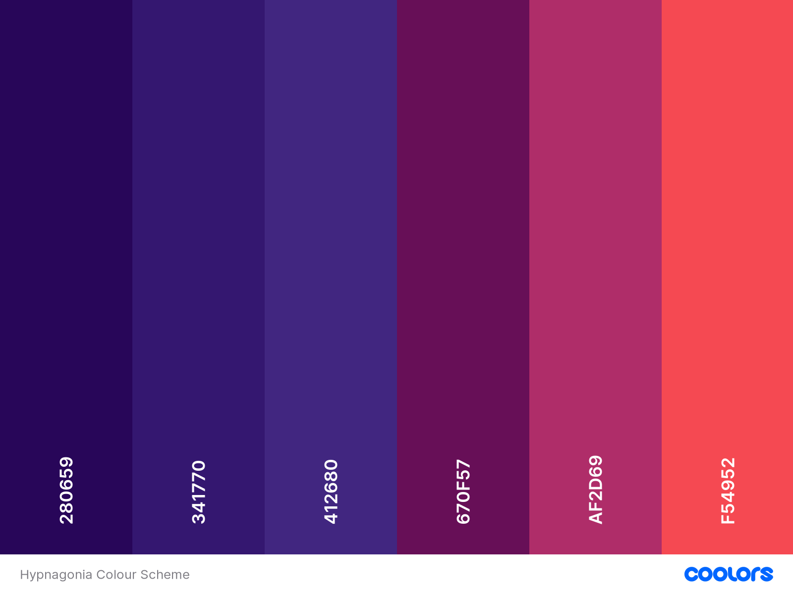
Axilirate pushed first to determine a colour scheme, so that we can try to coordinate between all designers. We settled on this one, initially based on the original journal design by SkylarkGSH.

First the main menu has received a new coat of paint, with an Artbreeder background, a new layout and even new Archetype icons. I also finally added the credits where you can click on the name of any of the contributors and be taken to the URL of their choice.

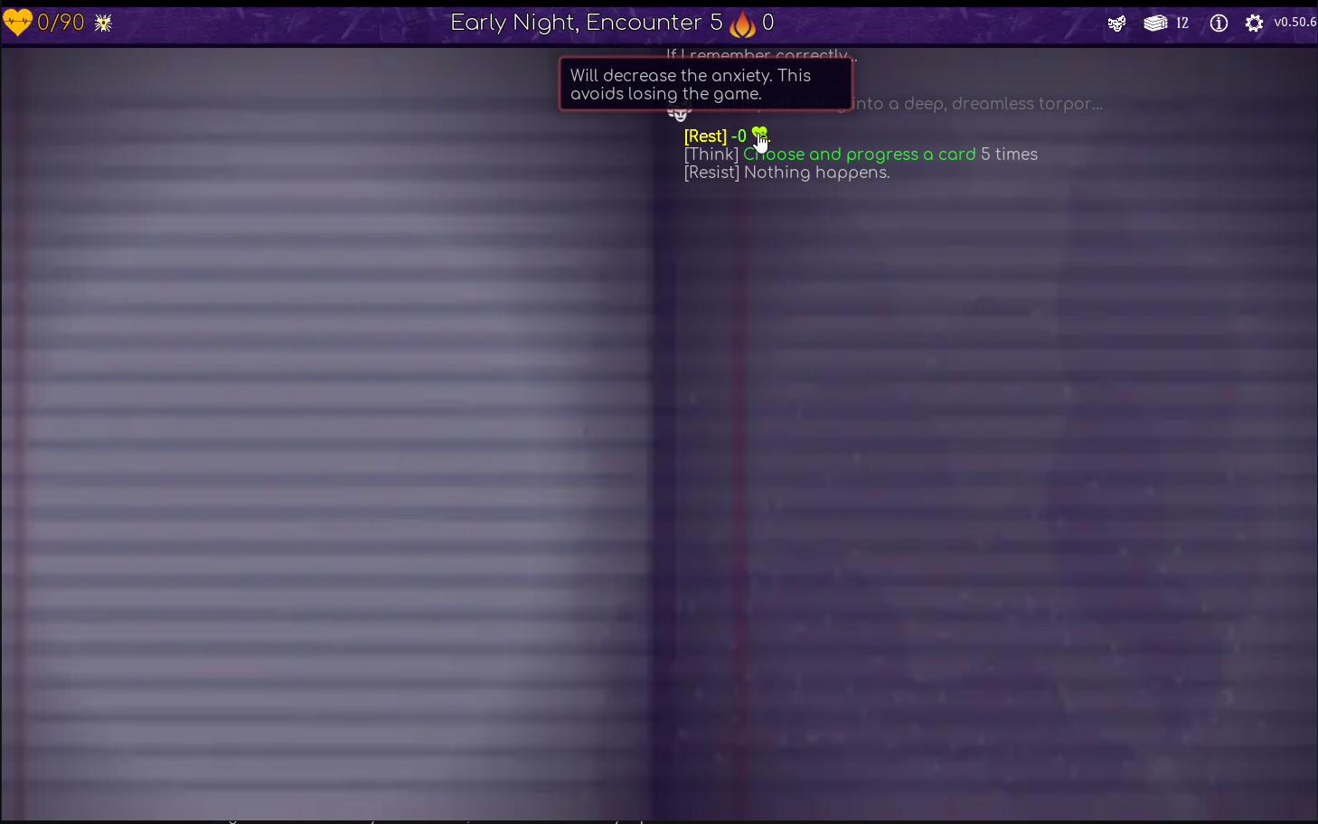
But also the Journal has been improved to actually transfer the theme of a dream journal where the dreamer is writing into. I’ve also worked to add more info popups on keywords in the journal, so that the player can get all the information conveniently, and on top of that I’ve also colour coded harmful effects red and beneficial effects green, to assist in decision making. It still needs a lot of work, but it definitely better than a off-black background with white text.

But the UI is not the only thing I’ve worked on. Other than the usual bugfixes and fluff additions, we have a few new Torments to ruin your day in Act3, as well as the much requested save/load function! You don’t have to lose your progress or keep Hypnagonia running for hours. Every time you finish an encounter, the game will automatically save the state,and will reload it when you press the continue button. As a roguelite, you’re not expected to keep multiple saves running of course, so if you start a new game, it will overwrite any run you currently have in progress.
And finally you might have noticed from the previous screenshot, that we finally have an official logo! This is made my a meatspace friend of mine who graciously volunteered their time for it and I think it looks pretty sweet!

All in all, quite a busy month for us, but there’s still a ton more work to do. Games like the recently released Beat Invaders really put me to shame by how good they look (but we have them beat on content! ;) ) so we’re going to continue chipping at this we have something we like.
If you have any ideas, as always, throw them at us!
Files
Get Hypnagonia
Hypnagonia
Therapy Through Nightmares
| Status | In development |
| Author | db0 |
| Genre | Card Game |
| Tags | 2D, Deck Building, Dreams, free-software, Godot, gpl, Open Source, Roguelite, Surreal |
| Languages | English |
More posts
- Long time, no update. But some new art now!Apr 06, 2025
- The PlusheningAug 24, 2022
- Integrating AI into storylineAug 14, 2022
- AI Generated Prompts for first act (experimental)Aug 12, 2022
- Diving deeper into AI storytelling with NLP-generated storiesAug 05, 2022
- ExploitationJul 25, 2022
- All the illustrations!Jul 19, 2022
- Creating card illustrations using the midjourney Neural NetworkJul 14, 2022
- Nope. Didn't like it.Jun 25, 2022
- The Big Currency RedesignJun 09, 2022
Leave a comment
Log in with itch.io to leave a comment.